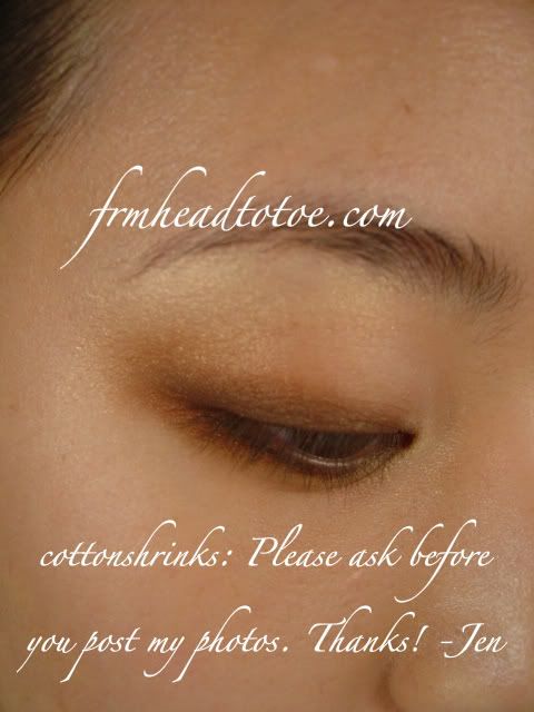
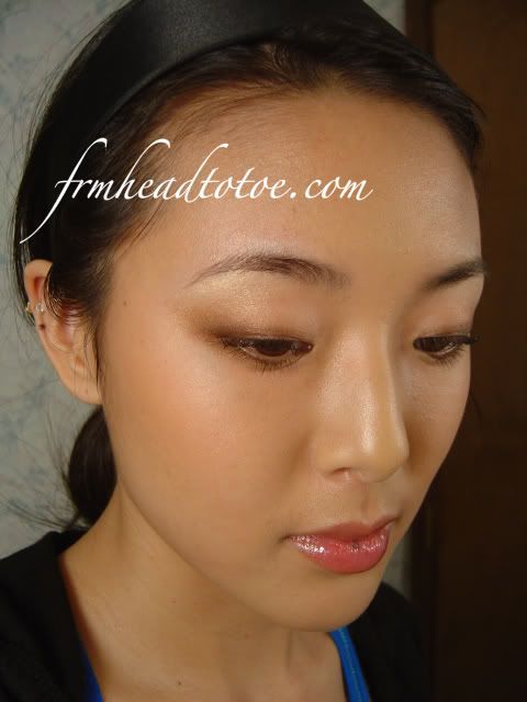
Have you ever wondered why certain colors look good or bad on you? Maybe you aren't sure if you can pull of a green top or purple eyeshadow. Since not everyone gets the chance to go to art or design school, I thought a lesson in color theory might be handy.

This is a color wheel. When it comes to beauty or fashion, the most important base color you are working with is your skin.
Analyze this:
Is your skin a warm tone? (reddish, pinky, peach)
Is it golden? (yellow, honey)
Is it cool? (olive, beige)
Is the shade lighter or darker?
When you tan, does it get an orangey undertone, golden undertone, or an olive undertone?
When you come to a conclusion, decide around where it falls on the color wheel. I have golden skin (yellow undertone) with a hint of warm tones. The shade is medium, but on the lighter side in winter. My tan color is golden to olive.
On the simple color wheel, I can approximately pick my winter color as "yellow-to-orange" and my summer color as "yellow-to-green."
The ideal colors to wear to balance out my skin are colors directly opposite on the color wheel. This means that in the wintertime, when my skin has a warmer tone, purples and royal blue really suit me. In contrast, certain bright reds, tans, and beige-tones really wash me out.
For the summer, my skin is more neutral in color, so I am able to wear the warmer reds and purples. I must note that my summer color is still quite warm though, and there are some rules that are more nuanced in each color family.
Generally, if you are warmer-toned, warmer shades look best. The same goes for cooler tones and cooler shades. For instance, turquoise, aqua, and royal blue are warmer colors in the blue family. These colors look good on my golden skin. Dusty blue, navy, and baby blue are cooler and make my skin look less lively.
Say you have pinky-peach, fair skin. Blues and greens probably look awesome on you, especially aqua and kelly green.
Say you have deeper tan, olive skin. You probably look really fantastic in maroon, plum, or burgundy. You can also look great in dusky pink and lavendar.
This isn't a guide that you must go 100% by at all times, but it really does help if you are trying to select any colored accessory including clothes, jewelry, nailpolish, colored lenses, hair color, blush, or eyeshadow. Go with colors that contrast your skin, but tones that match it.
Here's a list of my favorite colors to play with:
* jewel-toned green, blue, and purple
* warm pastels
* canary and banana yellow
* white
* black
* warm pinks (fuscia to hot pink to warm baby pink)
These are colors I avoid:
* any dusty colors (dusty pink, green, blue, purple)
* tans, browns, beiges
* orange
* cool grey and navy (these two work on occasion though)
Good luck matching and shopping with your newfound color knowledge!